How to Read Crypto Charts: A Beginner’s Guide to Technical Analysis
Estimated Reading Time: 3 minutes
Don’t invest unless you’re prepared to lose all the money you invest. This is a high-risk investment and you are unlikely to be protected if something goes wrong. Take 2 minutes to learn more

Look at a crypto chart for the first time and you’ll see a mess of lines, colors, and numbers. It can be overwhelming. But here’s the thing – reading charts is a skill anyone can learn.
Let’s break it down step by step.
Candlesticks: The Basics
Those green and red bars you see on every chart? They’re called candlesticks. Each one represents a specific time period – could be one minute, one hour, one day.
Here’s what matters:
The green (or white) candlesticks mean the price went UP during that period. The red (or black) ones mean it went down.
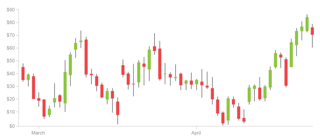
The body of the candlestick shows you where the price started and ended. The thin lines (called wicks or shadows) show you how high and low it went during that time.
Simple, right? Green = up, red = down.

Free Crypto Signals Channel
Support and Resistance
Now here’s where it gets useful. Look at where the price has bounced off certain levels multiple times. Those are your support and resistance zones.
Support is like a floor – the price has fallen to this level multiple times and bounced back up. Think of it as a price floor where buyers tend to step in.
Resistance is the ceiling – the price has hit this level multiple times and pulled back. It’s a price ceiling where sellers tend to step in.
When the price breaks through support, it often falls further. When it breaks through resistance, it tends to go higher. That’s the basic idea.
Moving Averages
Those wiggly lines overlaid on the chart? Those are moving averages. They smooth out price action so you can see the trend more clearly.
The 50-day moving average is popular – it shows the average price over the last 50 days. When the price is above this line, it generally means the trend is up. When it’s below, the trend is down.
Many traders watch for when the price crosses above or below these averages as potential buy or sell signals.
Volume: Don’t Ignore It
At the bottom of your chart, you’ll see vertical bars showing volume – how much was traded during each period.
High volume during a price move confirms the move is strong. Low volume means the move might not last. Always pay attention to volume.
Common Patterns
Once you’ve got the basics down, you can start spotting patterns:
- Head and shoulders – a reversal pattern that looks like… a head and shoulders
- Double top – two peaks at similar levels, suggests a reversal down
- Double bottom – two lows at similar levels, suggests a reversal up
- Cup and handle – a continuation pattern that looks like, well, a cup with a handle
You don’t need to memorize every pattern. Just knowing these basics helps you read charts better.
 Most Popular
- 2-5 Signals Daily
- 82% Success Rate
- Entry, Take Profit & Stop Loss
- Amount To Risk Per Trade
- Risk Reward Ratio
The Bottom Line
You don’t need to become a charting expert overnight. Start with the basics:
- Read candlesticks – green means up, red means down
Find support and resistance levels
Watch moving averages for trend direction
Pay attention to volume
From there, you can build up your knowledge. But these basics will help you understand what’s happening on any chart.
Want expert trade setups delivered to you? Get instant access to our VIP trading signals here.